Why should you conduct a direct mail campaign?
In a world where almost everyone is using social media, there is naturally a lot of competition – and it’s easy for your brand to get lost in the crowd.
Using direct mail gives you a higher chance of being noticed by the consumer. Studies show that a whopping 80% of traditional mail is opened, whereas only a mere 20% of emails are read.
This blog will share tips and tricks you can use to boost the quality of your direct mail – to impress your customers and prospects!
Let’s dive right in.
- Tip 1: Set an ultimate outcome for your campaign
- Tip 2: Create messaging that has value to the recipient
- Tip 3: Create an effective design that is clear and accessible
- Tip 4: Adding in extra incentives
- Tip 5: Impress your recipients with high quality print
Tip 1: Set an ultimate outcome for your campaign
Map out the long-term aim(s) that your business is wanting to achieve for the quarter – This could be absolutely anything and is personal to your business, but for example, it could be:
- Increasing brand awareness and getting new prospects on board
- Building loyalty with your existing clientele
- Driving sales of a specific product or service
Once you’ve set in stone what you want to achieve, you can create a smaller, more easily attainable goal to aim for within your direct mail campaign.
Tip 2: Create messaging that has value to the recipient
Tip 2: Create messaging that has value to the recipient
Before drafting the content for your artwork, you need to identify:
- Who will be seeing the material?
- What are their needs and wants?
- How will you show that you can add value to their lives by solving their pain points? (In most cases this is your product or service).
You have now created a starting point for writing your messaging.
Consistent branding is not only in regards of your brands visual appearance, but also your messaging and tone of voice.
You must also ensure that nothing said contradicts itself, as this makes you appear unreliable and the consumer may struggle to get on board with your brand.
Over the past decade, the average person’s attention span has shrunk by 50%.
Text that looks longwinded at a first glance will not entice the recipient to read. Ensure that
the information is separated into bitesize chunks to make it more engaging.
Your messaging must make it evident how you can provide value to the customer and solve their problems.
Where possible, back data up with evidence whether it be from a primary or secondary source. An example of this is testimonials or free a demo/sample.
Tip 3: Create an effective design that is clear and accessible
Ask yourself the question: “Is my brand recognisable just by the use of our colour scheme and a snippet of our logo?”
Here’s an example of one of the most identifiable brands in the world.
We’re certain you’ll be able to recognise them!
The perfect messaging has no use if the design is inaccessible for the reader.

Here are three things to check before signing a design off:
1. Is the text big enough to read once printed?
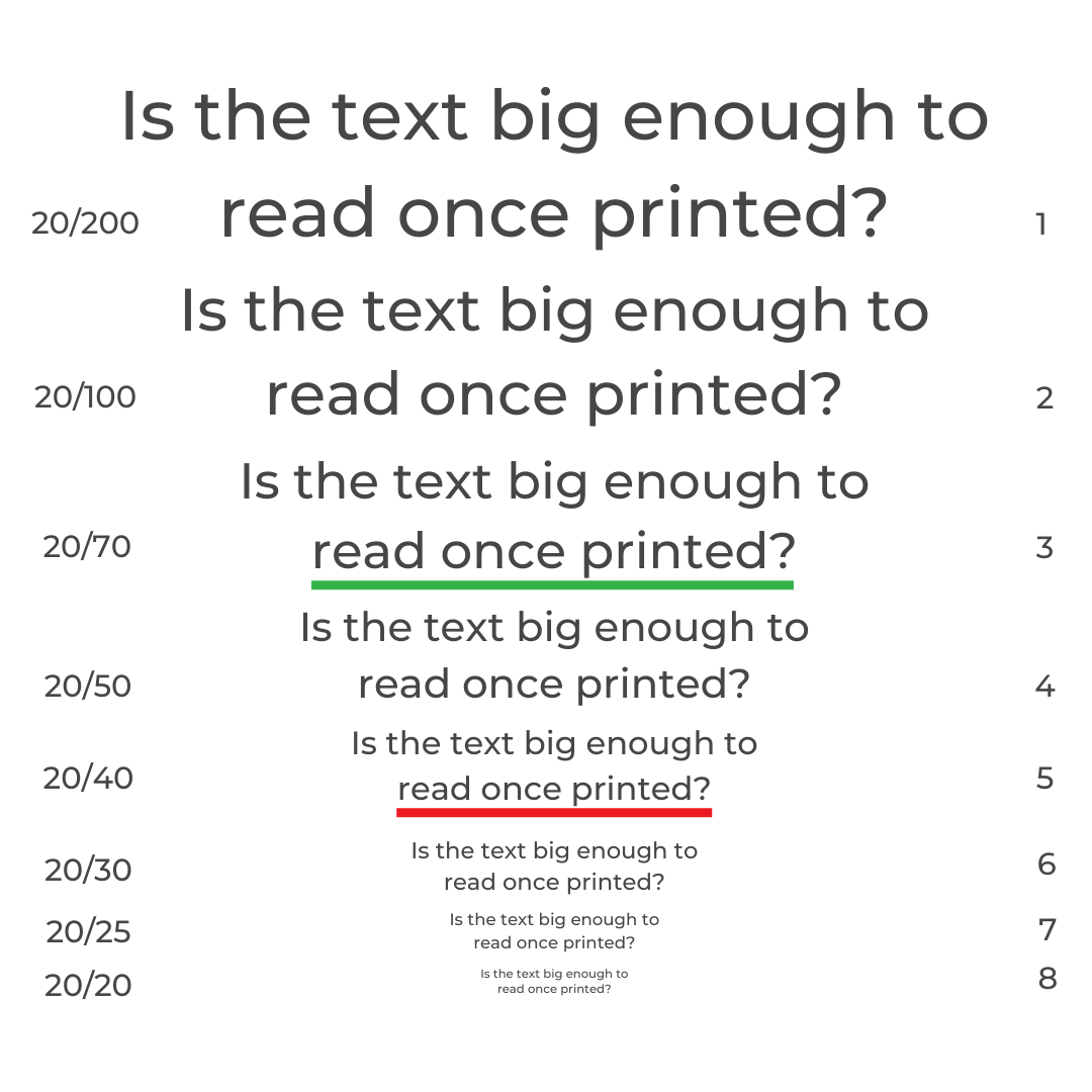
2. Is the text big enough to read once printed?
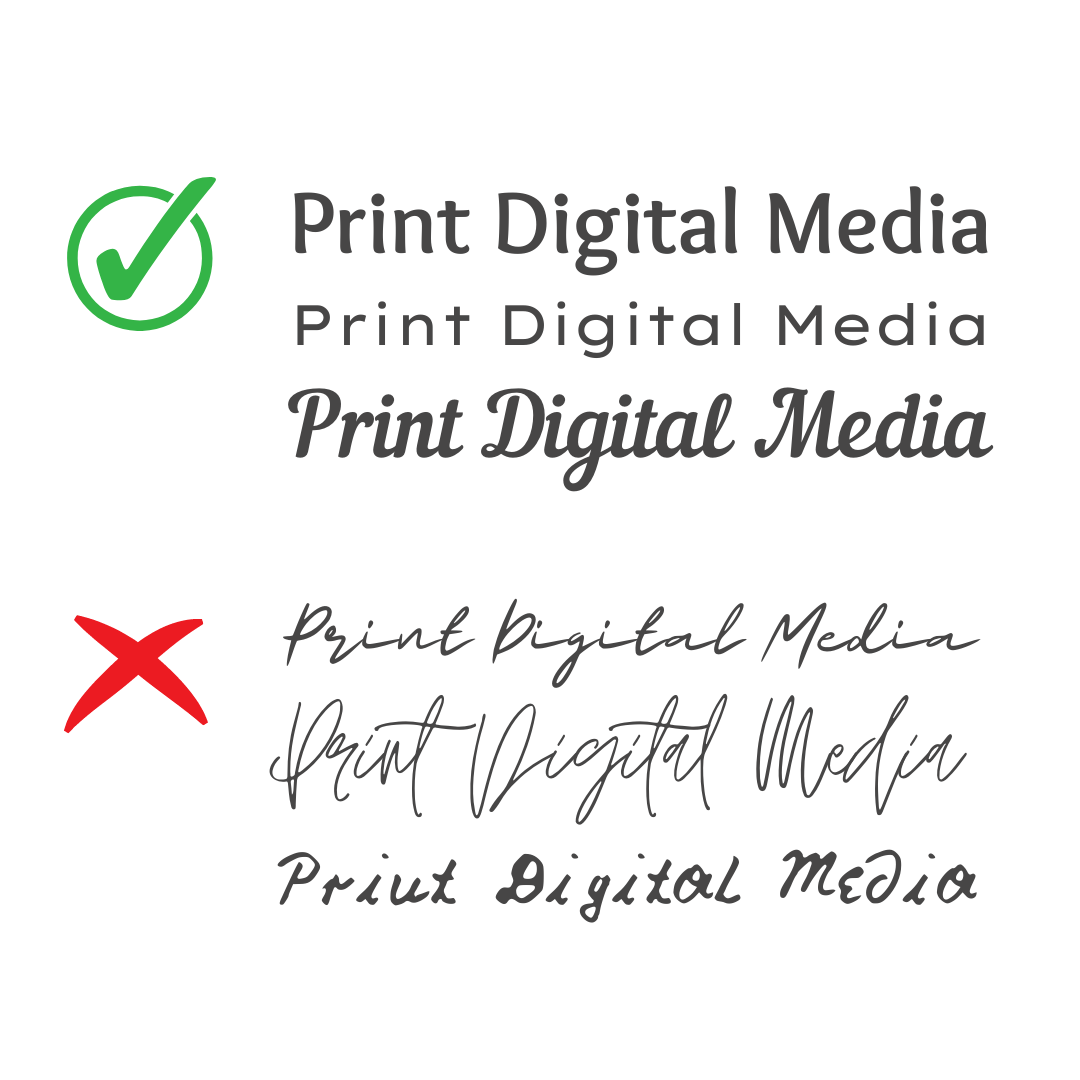
3. Is the text big enough to read once printed?
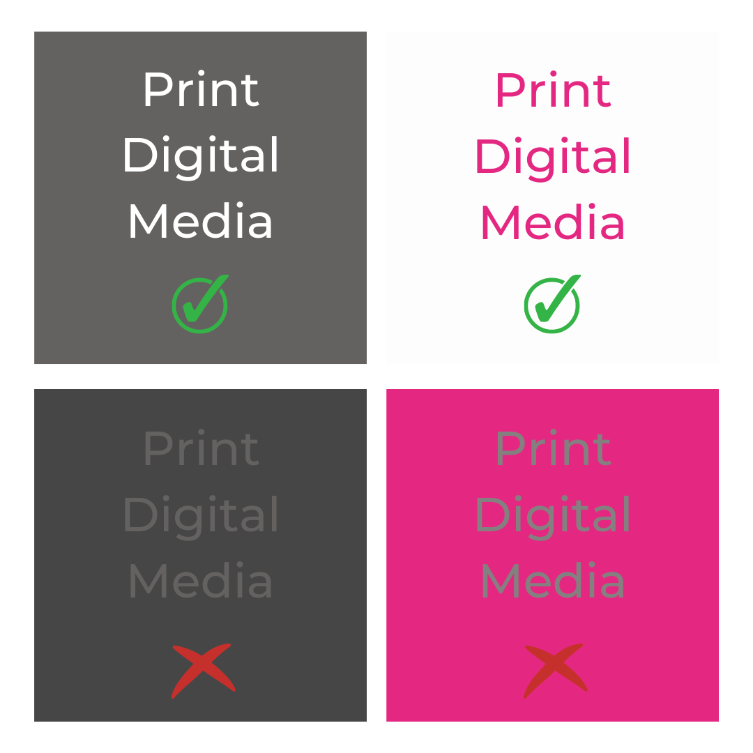
Review your final design with a co-worker or a friend – as a fresh set of eyes can bring new ideas alight.
Tip 4: Add in an extra incentive
Another great technique within print marketing to heighten brand awareness and recall is adding gifts with your branding on to your direct mail.
This could be something useful that they will keep handy, such as:
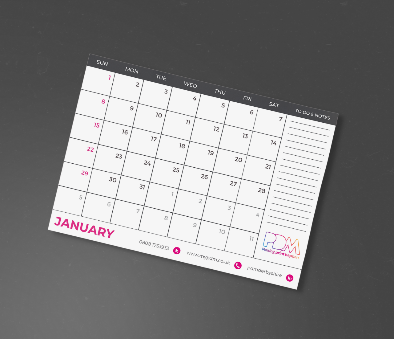
- A desk pad for jotting the shopping list on at home
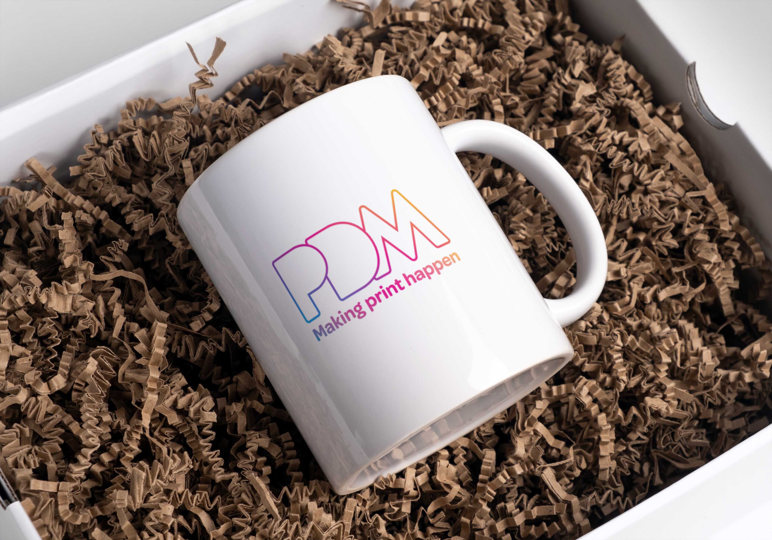
- A mug that sits on their desk each day
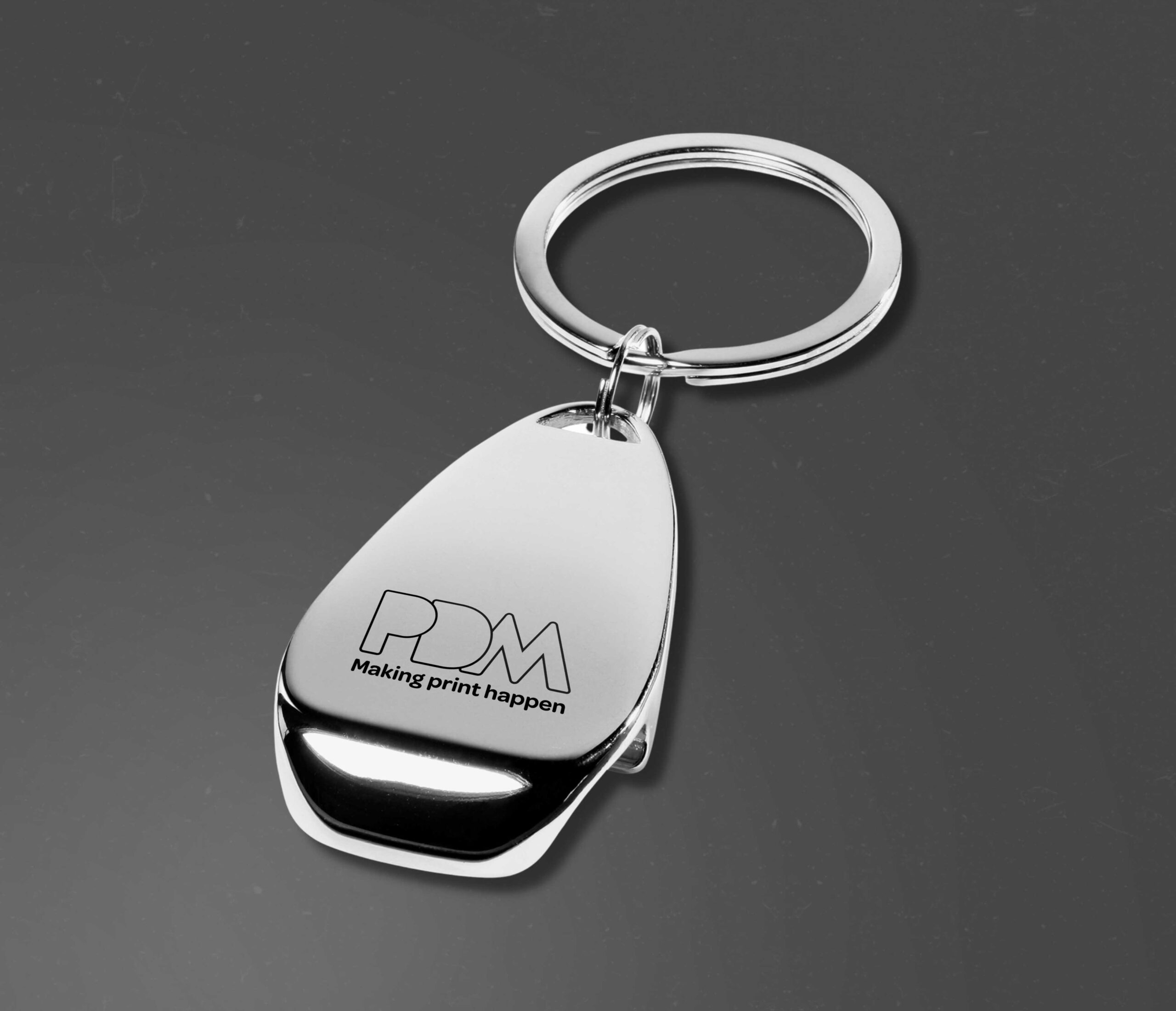
- Or a keyring to add to their car keys
These are the kind of gifts are valuable as they keep you in frame of mind almost every day – and if they ever need your services its likely you’ll be first to mind!
Tip 5: Impress your recipients with high quality print
It’s important to choose high quality print for your artwork, as the quality will reflect your readers perception of your business’s goods and services.
Look beyond the visual aspect of your print, and consider experimenting with a range of textures, folds to create interest.
We offer various finishes for your print that provide a range of benefits to its appearance:

Matte Lamination paired with Spot UV
If you are looking for a premium appearance, we recommend a combination of matte lamination and spot UV.
This finish creates a soft touch to the paper, but the spot UV bounces off light when movement is created – it certainly sparks attention creates that wow factor!
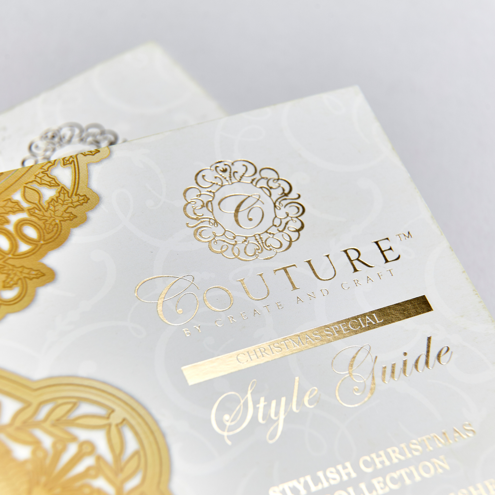
Gold and silver foiling
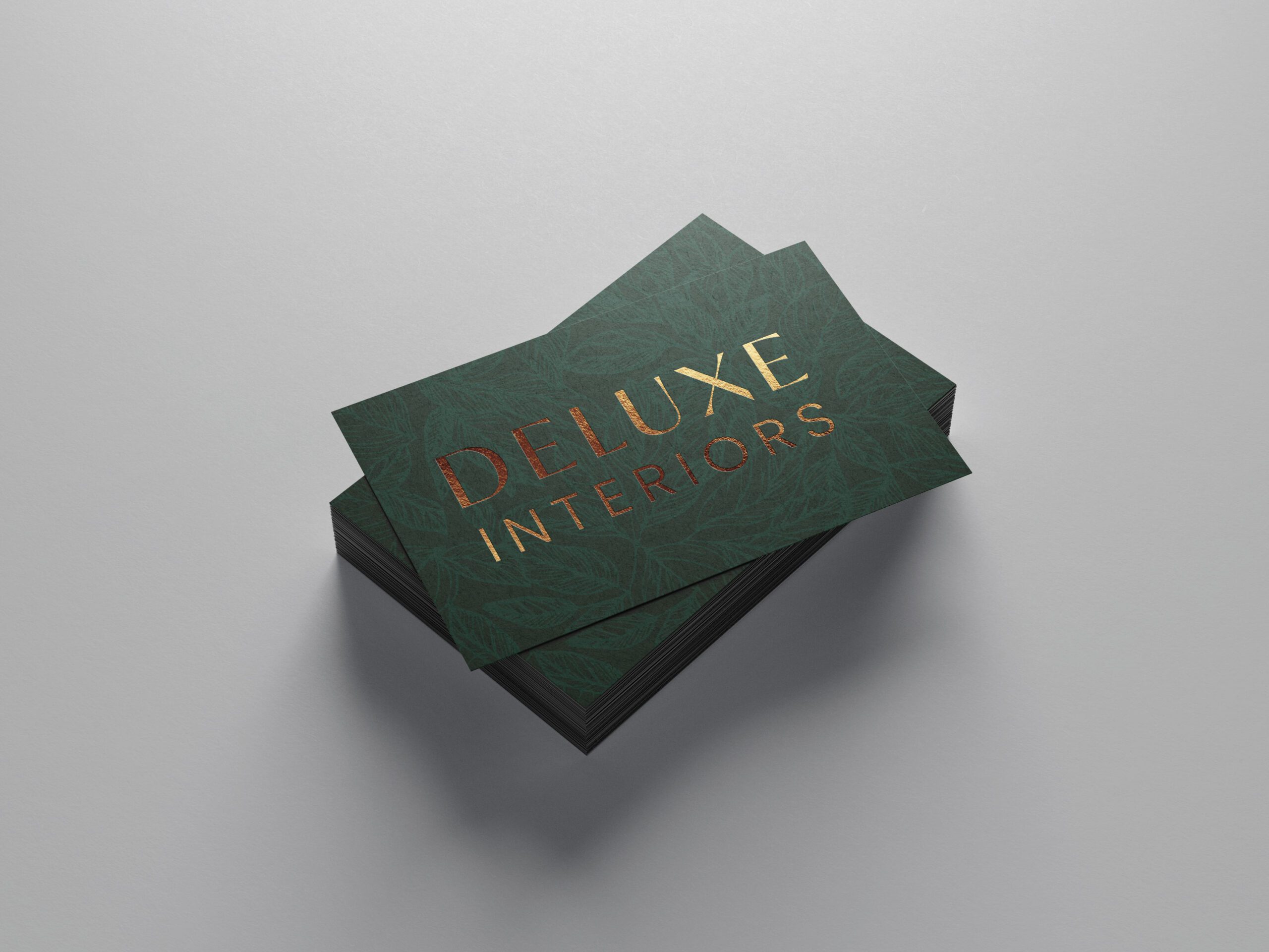
Using gold and silver foiling on important elements of your artwork will give it a deluxe appearance – and will improve the recipient’s perception of your brand image.

Gloss lamination
Gloss lamination will increase the durability of your print, which is useful if it is intended for the recipient to hang onto it and use it more than once.
It also amplifies the colours of the print, which is great for any artwork that features bright colours.
Let’s get started on your next print campaign today!
If you’re looking for a new print partner – why not give us a try? Our staff have 50+ years industry experience and provide specialist knowledge, competitive prices and a friendly service.
We provide the complete solution, from initial design to proof and print, whether your requirements are large or small, we can create a project package that works for you.

